 Ani Akopyan / Product Designer
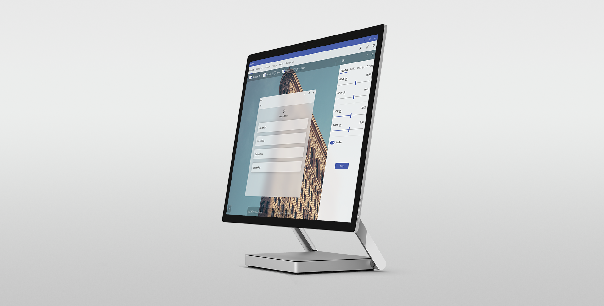
Windows Community Toolkit
Redesign of existing toolkit for developers
Overview & Goal
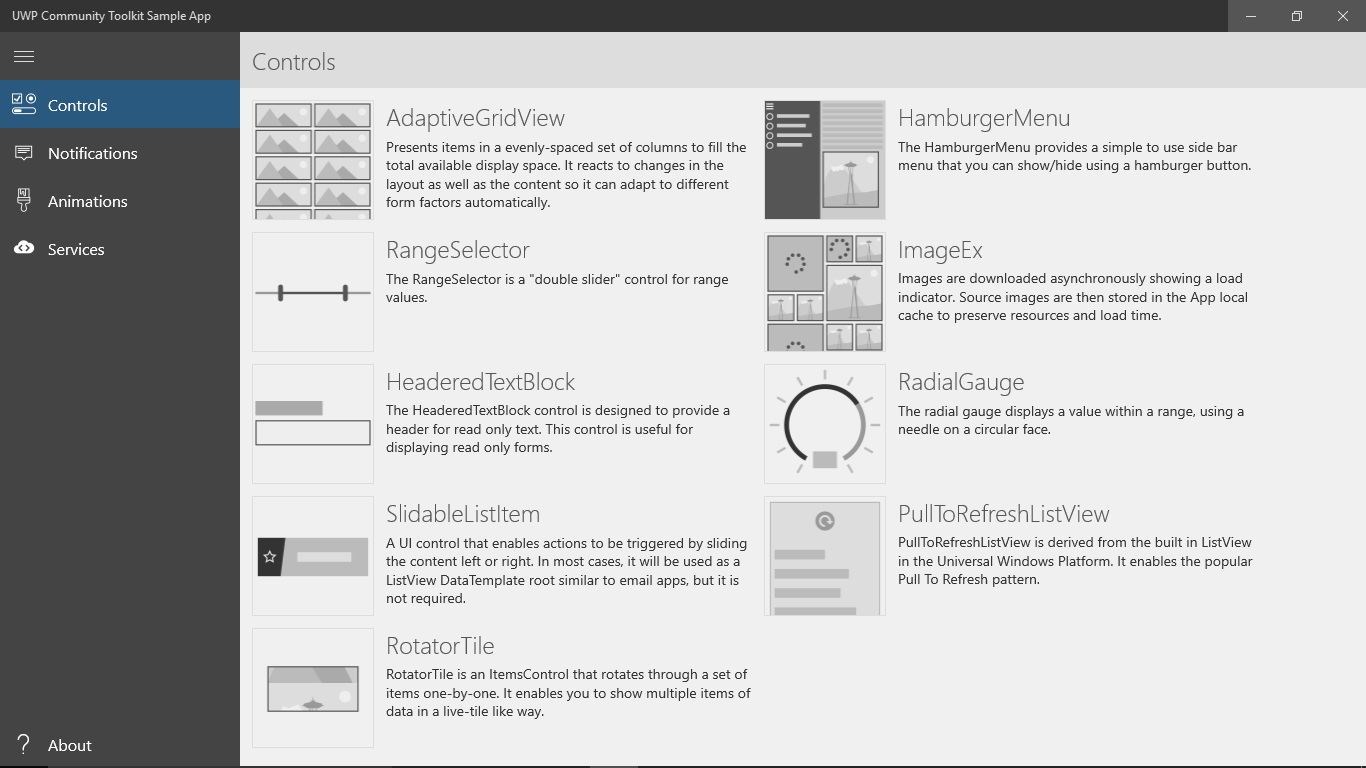
Sample app for developers that demonstrates the custom controls, app services and helper functions in the Windows Community Toolkit to help build UWP apps for Windows 10. Research, usability study and redesign was intended to ease the workflow of developers and designers and confirm effectiveness of updates.Purpose of this App
- Educate developers and designers about UWP elements available to them
- Ease their app development process by making it more efficient
- Communication tool between designers & developers
Responsibilities
UX Design, Conceptualizing, Wireframing, Design Direction, Research & Usability studyTeammate
Vlad NoginBefore: Issues and Goals
Before the revamp, the design of the app and controls were outdated. Another issue was that the use of the navigation required users to abandon their current page resulting in a feeling of loss of control from a user standpoint.
The goal of research was to find a solution for this problem, as well as confirm or invalidate hypotheses around usability.
Redesign
We tried addressing and solving the issues in the redesigns. It’s a continuous process and we are still evolving the app.


Research & Usability Study
I initiated and led a research plan to gain deeper qualitative insight into the product pain‐points and to look for opportunities to evolve the product. Over a three‐week period, I found a research team that was willing to help run a usability study. We also used this time to test the viability of future concepts.
1st Redesign
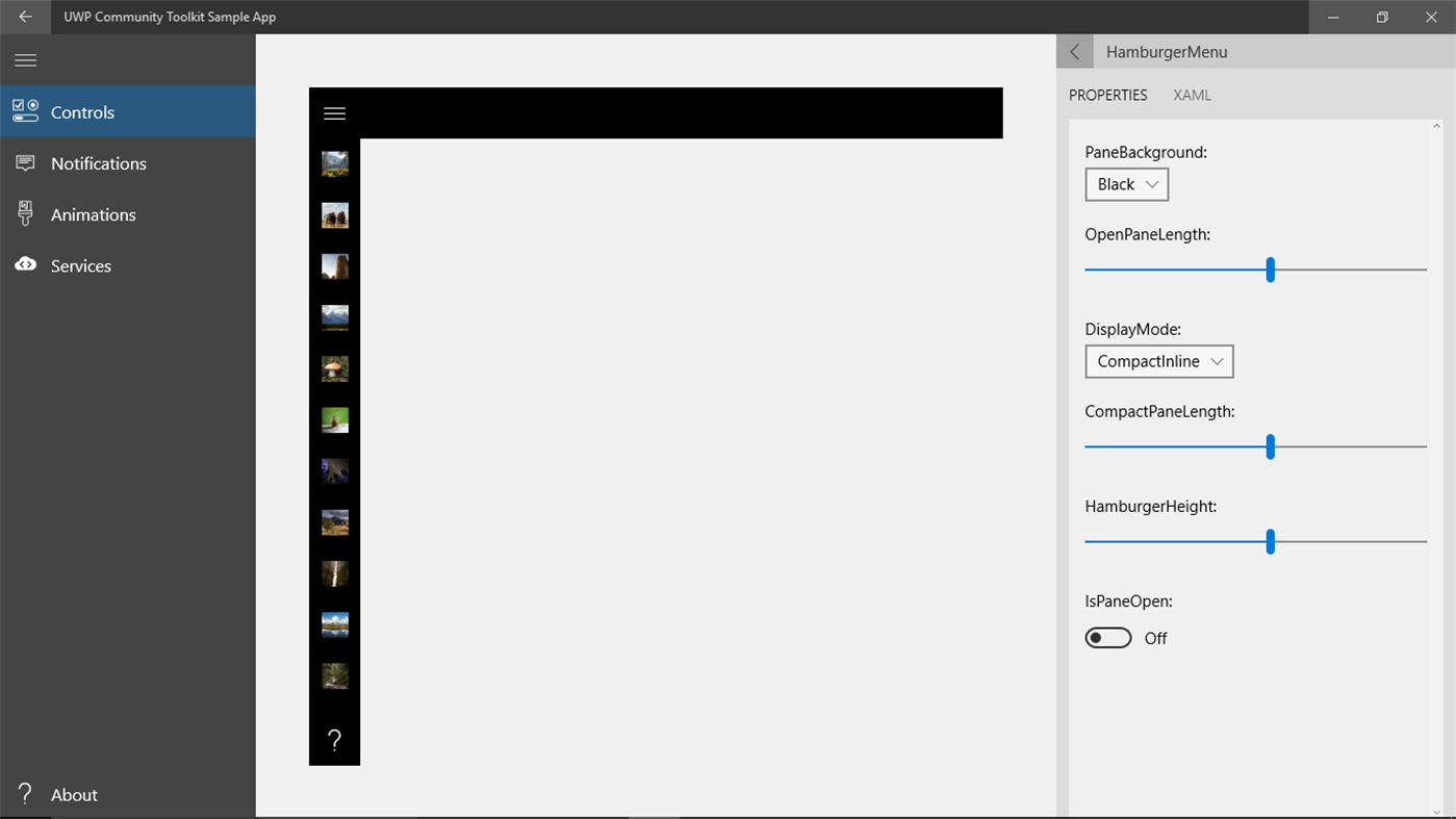
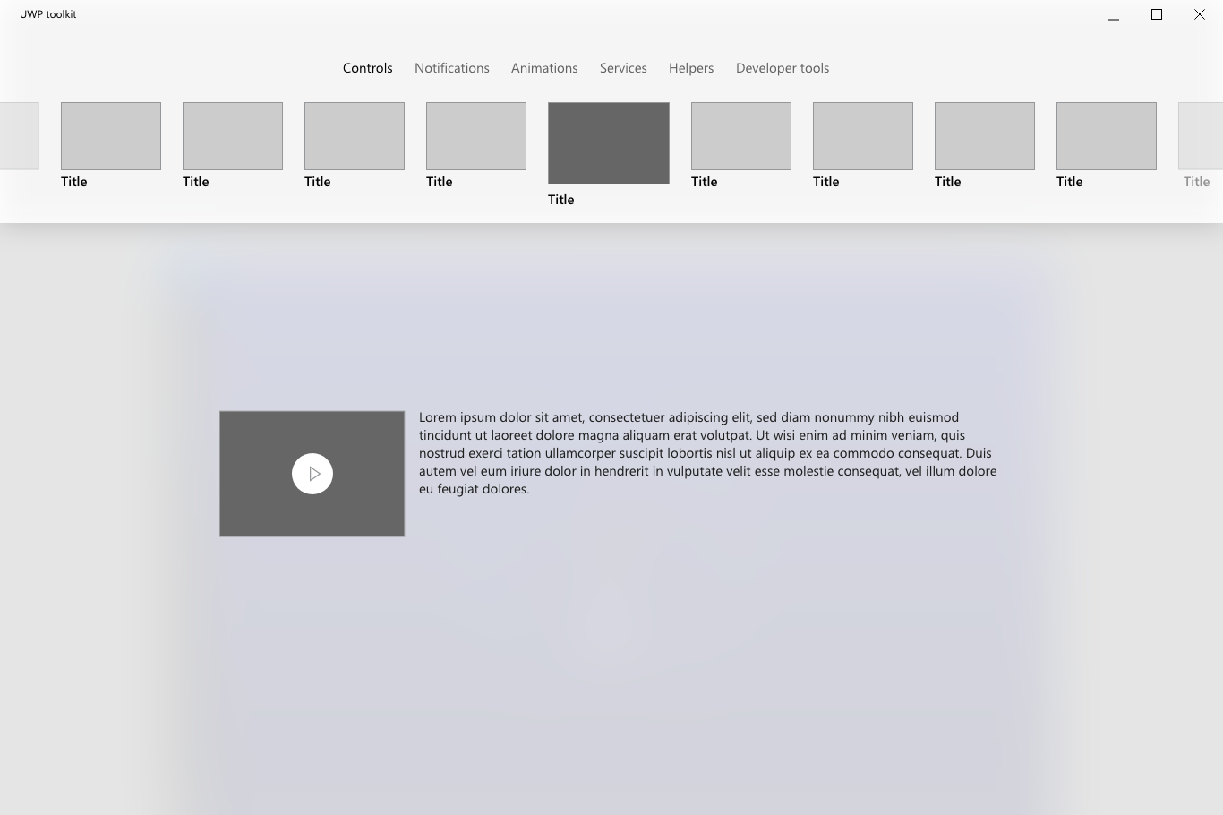
Navigation
Goal: An interactive but clear navigation that also allows for easy exploration without abandoning current page
Takeaways: After the initial redesign, 7/10 participants had trouble adjusting to the constantly changing descriptions on hover, as well as the horizontal scroll.
Solution: Instead of showing descriptions when hovering over thumbnails, “More Info” can be invoked by clicking the chevron icon to the right of the title, while clicking on a thumbnail goes directly to the target page.
Result: By avoiding the “jumpy” interaction of changing descriptions on hover, we gave the user the choice to invoke as needed which led to more clarity and less visual strain. By displaying all thumbnails and avoiding horizontal scroll, users were able to see all content and, thus, explore more efficiently.
Evolution of the Navigation
2nd Redesign
Goal: To confirm or invalidate hypothesese around usability
Hypothesese around the customer problem:
- Navigation might be unclear
- Might be unclear that the dropdown chevron reveals details/information vs. thumbnail selection
- They might have trouble finding the heart icon to “like” the feature for feedback and also might mistake it as "Favorites"
- They might have trouble locating the link to leave feedback
- Saving code is a new feature the user might not be accustomed to therefore might ignore
- New users might not know how to use the toolkit in their own app
How you define success of product/feature:
- Learn & discover how developers are using the app to add APIs into their own app (how it fits into their process)
- If user can navigate the app easily after initial set up
- If it's clear that chevron opens details about an element
- If user can understand they can use both properties and code for adjusting the control
- If key features are discoverable & useful, i.e. saving code, XAML editor, liking a control, leaving feedback
Key Insights:
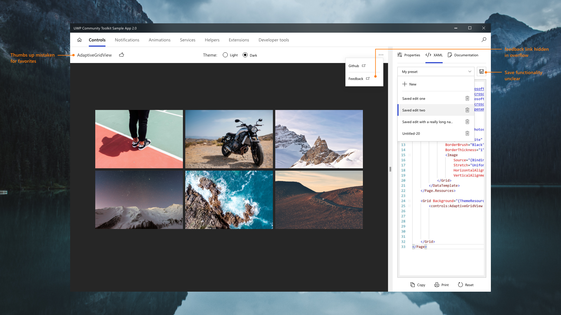
- Users had no trouble understanding and using the chevron to invoke more details
- Users mistook the heart icon (intended for feedback) for “favorites”- even after changing it to thumbs up
- Users could not find the feedback link hidden in the overflow
- Functionality of saving code as preset was confusing
Solution:
- Changed the heart icon next to the title first to thumbs up but after hearing same feedback, changed to the phrase “Was this control helpful?” with thumbs up and down. Once invoked, a textbox would appear for leaving feedback
- Made saving preset button more prominent and moved to bottom right of the panel
- Explored different Nav options to be more in line with UWP apps
Design Explorations after Study

Current Explorations
After some more iterations, we decided to keep the top navigation after all because it established a good visual hierarchy and balanced out the otherwise information-heavy app, as well as taking up less space then a side-nav. Also, users were more fond of the top-navigation.
Since there were no set explorations around a master-detail view for a top nav yet, we set out to explore the option of a sidenav as secondary navigation that could be collapsed when not in use in order to give the main content more space.
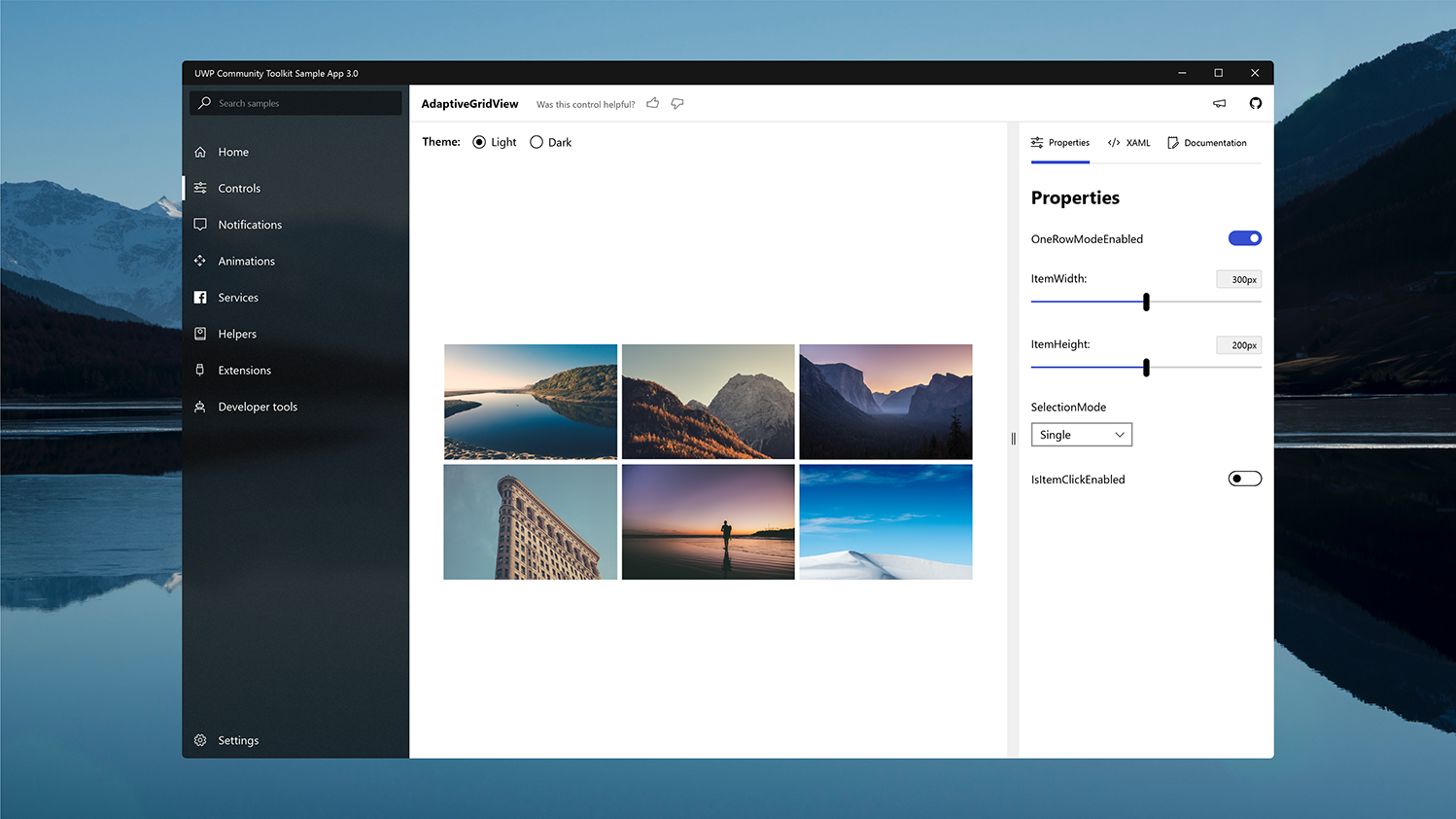
In the image below the different areas are marked in the order of hierarchy based on the steps we we wanted the user to focus in order. The right bar marked as zone 1 were the previous pivots, i.e. Properties, Xaml and documentation that lived on top of the panel. The reason behind placing it vertically on the right was to be able to have different widths of the panel next to it (#2 area) based on what was selected. For example, Xaml code panel needed much wider width than the properties panel but using pivots or tabs, the user would have the expectation that they all needed to be same width.
